How to Match Colors in Fountain Design
Publish Time:2019/08/22 NEWS 标签:fountain designNumber of views:1101
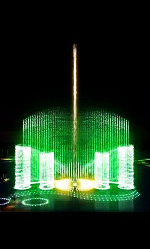
With the rapid development of the city, the city’s appearance also needs to be improved, so the implementation of the city square has increased significantly, and fountains are almost necessary facilities for every square, its performance also presents a diversified trend. Today I will give you a detailed introduction on how to match the color of fountain design.

1. In fountain design, color matching should not be too much. Usually, for general flower beds, 2-3 kinds are enough. If it is a large flower beds, 4-5 kinds of colors are needed. If the color matching is increased again, it will appear disorderly and can not show the colour effect of the group.
2. The colour of fountain should be combined with its function. If it is a basic fountain, it should cooperate with the main body, so that it can play the role of foiling the main building, and can not adopt excessively bright colour to prevent the noisy guests from taking the lead. If it is a traffic fountain, we must make the fountain design more eye-catching; if it is a festival. Daily fountains, or decorative flower beds, should be distinguished from the surrounding environment.
3. When matching the color of fountain, we should also consider the influence of color on people’s psychology and vision. Usually cold tone can produce visual shrinkage effect; warm tone can expand people’s area; at the same time, we should consider the size of each color and the width of the pattern.
4. Fountain design should also pay attention to the use of contrast colors, such color matching feel very lively and lively, light tone soft, dark tone can be exciting, they can be combined to form a strong contrast, deepen the impression. For the same tone, although not used much, but if it is a small area of flower beds, or can play a certain role in decoration.
In the fountain design color matching, you can refer to the above several contents for design, and pay attention to the rational application of contrast color and homotone. In the fountain text pattern matching, it is also exquisite, generally using light color as background color, using dark color to modify the text, this effect is very good.
- What are the main functions of water featu...
- What are the keys to the design and placem...
- How to Create Novel Fountain Design and In...
- What are the styles of fountain nozzles?
- What are the main points of fountain design?
- Introduction of Basic Water Type of Laser ...
- System composition of fountain equipment
- Points for Attention in Fountain Design Co...


